Signed in as:
filler@godaddy.com

Signed in as:
filler@godaddy.com
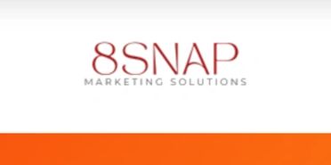
Lynette reached out from 8 Snap Marketing Solutions looking to refresh her existing business logo. The challenges of the current logo were that there was no logomark available to diversify the use of the logo across platforms, and this kept the logo in landscape mode only - forcing a reduction in scale and readability. In the past, logo designs incorporating the 8 were difficult to translate because the "8" tended to read as an infinity symbol or an unrelated abstract shape.
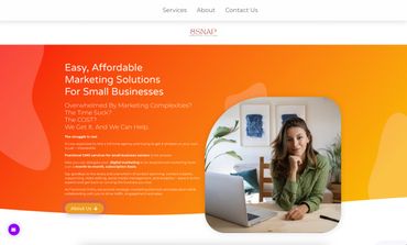
With the new design, the abstract logomark nods to the "M, S", and "8" in the business name. It was important to the client to have a very clean professional look. We stuck with a typeface that allows for versatility and sans serif style for bold but delicate high contrast copy. We kept the line work light, clean, and symmetrical for a design that will stand the test of time. We also committed to delivering ga brand Guide so future visual brand changes remain cohesive and to ADA standards.
With the addition of the color palette, the logo is lifted even further giving this fractional marketing agency a really elevated look. They started with a brighter warm gradient on the website which was not as ideal for accessibility and limits color combination options for future designs. By deepening the red and creating a warm but rich palette around their original inspiration, we landed on colors that feel luxurious, and inviting.

Lynette G, Owner of 8 Snap Marketing Solutions
We use cookies to analyze website traffic and optimize your website experience. By accepting our use of cookies, your data will be aggregated with all other user data.